Background
Over the last decade plethora of genome-wide association studies (GWAS) data has been generated, requiring development of novel tools for visualization of large quantities of data. Quantile-quantile plots and Manhattan plots are the classical tools which have been utilized to present GWAS results and identify variants that are significantly associated with traits of interests. However, static visualizations are rather limiting in the information that can be shown. It is only in recent years that dynamic, interactive visualization has become more widely adopted, however it has not yet become a routine part of GWAS data analysis. Interactive data visualization not only allows to more clearly represent multidimensional data, but also encourages viewer’s engagement from simple data browsing to providing a platform for answering specific scientific questions, in ways that static data cannot. Here we present a package for viewing GWAS results not only using classic static Manhattan and quantile-quantile plots, but also through interactive extension which allows to visualize data interactively: zoom into dense regions, quickly obtain underlying details (e.g. SNP rs number or gene name, base pair position, p-value) by selecting a peak of interest, and visualizing the relationships between GWAS results from multiple groups. Furthermore, a scientist might be interested in comparing GWAS results from multiple groups: (1) various traits/phenotypes measured in a group of individuals, (2) same phenotype measured among distinct groups of individuals such as males and females, (3) expression quantitative loci measures across different tissues, and (4) various experimental conditions such as before and after drug treatment, to name a few. Our tool makes it possible to browse multiple charts in real-time to better understand the relationships among multiple groups.
Examples
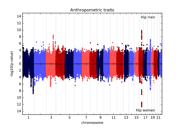
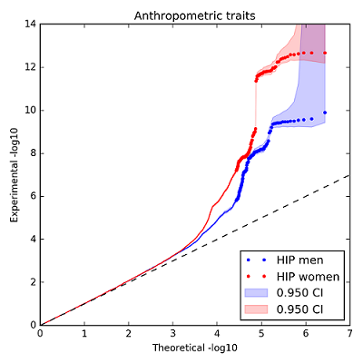
Here is an example of the static inverted Manhattan plot (also known as the Chicago plot) and a quantile-quantile plot that can be generated using assocplots. The data plotted here are from the GIANT Consortium and are fully described in Randall JC, Winkler TW, Kutalik Z, Berndt SI, Jackson AU, Monda KL, et al. (2013) Sex-stratified Genome-wide Association Studies Including 270,000 Individuals Show Sexual Dimorphism in Genetic Loci for Anthropometric Traits. PLoS Genet 9(6): e1003500. doi:10.1371/journal.pgen.1003500
The interactive plot of the same data can be found here. Note, due to the limitations (see below), only the top few significant points are displayed.
Implementation
Assocplots is implemented as a package for the Python programming language. Its basic functionality includes plotting interactive data visualization for viewing in the browser as well as static publication quality plots. The package is designed to be used both in Jupyter notebooks and in command line. Visualizing GWAS data in a web-based document (notebook), ensures data analysis reproducibility and makes it conveniently sharable with collaborators via online repository like GitHub. The assocplots package is open source and distributed via GitHub along with examples, documentation and installation instructions.
Limitations
Generally, interactive visualization made through web browsers are limited by the number of objects they can smoothly display. The current example shows the top (most significant) 1,000 SNPs in each of the two groups, with matching SNPs in the opposite group. To address this limitation, the package can be extended to a web application with dynamic data loading from a database/server. Dynamic data loading would allow to load SNP data in real time for a specific region of interest as the user zooms-in. By making this an open source package that is accessible via GitHub, we invite members of the scientific community to contribute and enhance the package’s capabilities.
Presentation
Poster, Biology of Genomes, May 2016, Cold Spring Harbor Laboratories.